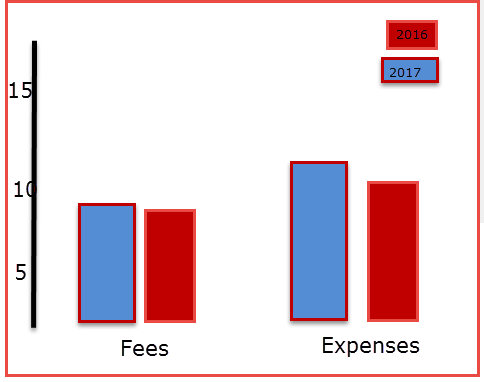
This seems like it should be simple, but my reports have always been nothing but tables, and I'm having difficulty with a chart.It seems like it should be a simple bar chart, but no matter what I try, it puts both the 2016 bars together, follow by both the 2017 bars. (The picture attached is just in Paint, not in SSRS, just to show what I'm trying to do). I am using Report Builder 11.0.
Suppose my dataset has 3 fields, Year, Expenses, Fees.
I want it to display like this: